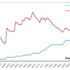
This one explains itself…

If you’re looking for more charts of the like, search no further than the Economic Policy Institute‘s The State of Working America. The one above is from their Income & Poverty category, which brings together two things that are supposed to cancel each other out.
As long as employees are considered expenses, as opposed to, say, investments, they will continue to get squeezed rather than appreciated.
[State of Working America chart via zunguzunga]