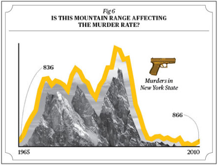
First we have a couple of samples from a Businessweek feature on the ease of using charts and data to say whatever you want.
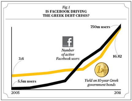 Just because some numbers line up doesn’t make it meaningful. Yet to look at it, say skimming this page and only looking at the charts, you might wonder why Facebook has to be such a bully. Who knows what drives the yield on government bonds in the first place? Oil, debt, Facebook, it’s usually one of the three.
In the case of the mountain though, perhaps it would be best to leave this one alone.
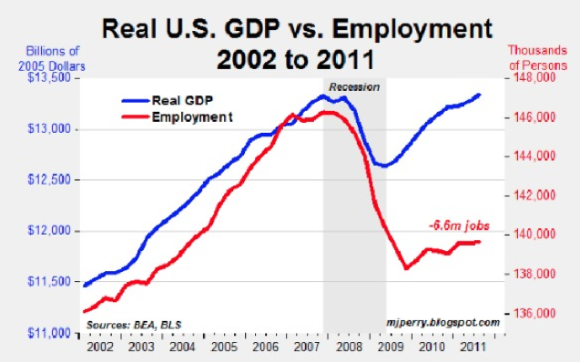
That, of course, leaves us with the unfunny. Lines that moved together until one slipped and the other failed to notice…
Sadly, this last chart tells us something. Namely, that the economy doesn’t really care about 6.6 million of us no longer having jobs.
Have a great weekend!
[Final chart via The Atlantic‘s Most Important Graphs of 2011]
damon
You know it. A few years ago, everything in America was done by 150 million. Now it’s 144 million. Some day, it will be 50 million, and then 1 million. What a sad thing. Those pooor million people that still have to work while the rest of us relax with our fulfilling hobbies.
Ape Con Myth › Untitled Minimum Wage Post
[…] wage is one of those things, but why? Because the economy is a murky pool where it is easy to make correlations and often impossible to prove anything, especially what any one value will do to everything else […]