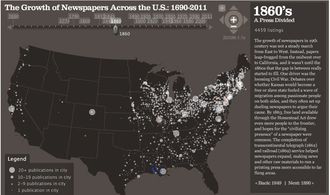
See how the light spread from sea to shining sea…
Those spots of color are papers in different languages. Maybe next someone will make one of these where the holdings of the media conglomerates are shaded in by owner. MediaOwners.com would be a great place to start for such an endeavor. (Or has it already been done? Please comment if you know.)
Meanwhile, you can probably follow some of the dots’ comings and goings by cross-referencing this chart of historical U.S. metropolitan area population rankings.
[Map by Stanford University’s Rural West Initiative via visual.ly]

