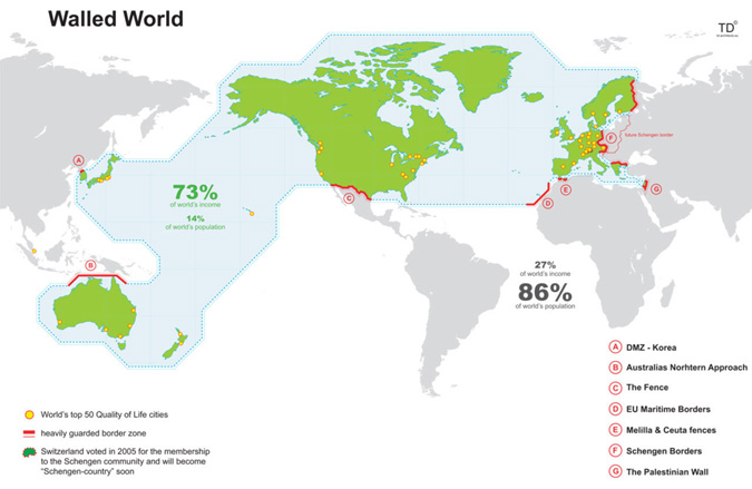
We begin with a map. A map from TD-Architects, which seems to have a lot of interesting content though remarkably difficult navigation. A map that might be from 2006 or 2007 (or 2009?). The source of the income data? Unknown.
Anyway, the idea of the map is that 73% of the world’s income is being protected on all sides by walls or, as they are called, “heavily guarded border zones” in an effort to create the “greatest wall” ever built on this planet. Go ahead, take a look…
If you want get into the flaws of the map, reddit has conveniently ripped it apart on multiple occasions, including this 400+ comment thread. The gist is that “heavily guarded” is an exaggeration, the selections are arbitrary, and there are plenty of wealthy areas outside these borders. … But is it still conceptually interesting?
While looking into the income data, it turned out that these countries within the so-called walled world match up with the World Bank‘s list of “High Income” members of the Organisation for Economic Co-operation and Development (OECD). Since 1973, these countries have made 70-80% of the world’s income year after year, that is until 2006 when their percentage started to drop. The situation really is changing, and as of 2010 the high income OCEDers were down to 63%, but the map really is a SNapshot Of Globalization, which is what TD’s SNOGs are all about.
Tomorrow we’ll use a somewhat flawed chart to take this a step further.
For more on those walls: DMZ, Australian Defense Force, Mexico-United States barrier, EU Maritime Borders, Melilla & Ceuta border fences, Schengen Area, Israeli West Bank barrier.
For more on the data: The World Bank is offering a killer 200,000+ line spreadsheet full of all kinds of data or if you’re more of a charts person, check it out via Google’s Public Data Explorer.
[Map via Information is Beautiful]

