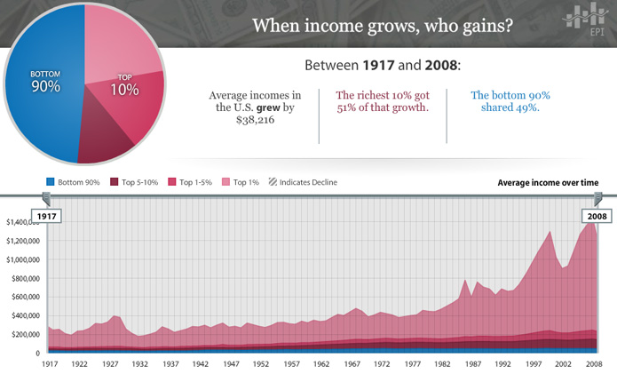
With the Economic Policy Institute’s interactive chart of average incomes in the U.S. between 1917 and 2008, it is easy to lose focus as your eyes shift from one baffling number to the next. In the time that it took to go from radio to the internet, average incomes only grew by $38,216? … And that growth was split 51%/49% between 10% and 90% of the population?
There’s no end to the configurations you can explore in the chart and all of them lay out the story in a different way. For instance, here’s a stroll through the data by decade that is a real tearjerker.


Oh, things have changed alright.
[EPI’s The State of Working America chart via The Atlantic]


damon
Between 1998 and 2001…
http://d.pr/i/bnIp
Was there ever another time like that?