The Who’s When & Where of People with a Page on Wikipedia

Founded in 2001 to study the societal implications of the internet, the Oxford Internet Institute has a growing collection of data visualizations that sketch out the state of information proliferation worldwide.

Below we have a Time-series of the Distribution of Biographies on Wikipedia over the Last Five Centuries, which provides a startling reminder of how many people are still not part of the conversation.
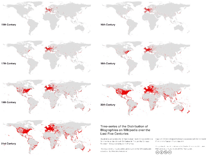
To see how far our globalization has yet to go, check out the OII’s charts on Academic Knowledge and Language, User-generated Content in Google and A Geography of Twitter.
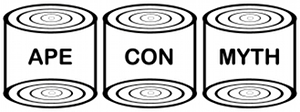
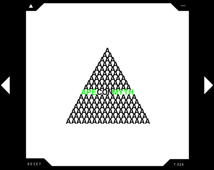
An Equilateral Triangularity Employer

When it comes to art based research, it helps to have a conceptual focus to guide your exploration.  For Ape Con Myth, it’s the words Ape Con Myth themselves that encapsulate everything you need to know about Ape Con Myth.

Over at Triangulation Blog, however, the world revolves around our pointy friend, the triangle.  And while you should head on over to their site for the latest in new media art, we recommend stopping by Interactive Triangulation first to really get your head around through the triangle, so to speak…

[Interactive Triangulation]

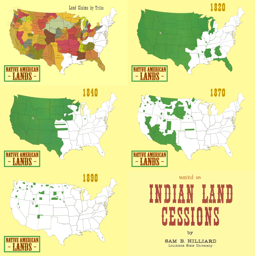
Indian Land Cessions (or Going, Going, …)

It plays out the same way every time…

To take a closer look, try the set of 67 maps collected in part two of the Eighteenth Annual Report of the Bureau of American Ethnology to the Secretary of the Smithsonian Institution, 1896-97.

[Animated gif by Somersaultr via Chart Porn]

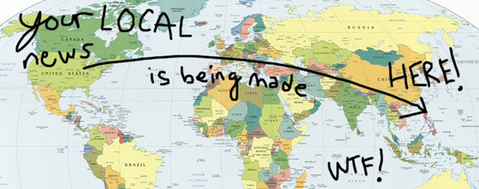
Stop Outsourcing Local News (or I Can See You Fine From Here)

The short of it?

For more on the subject, here is This American Life’s segment about local news getting reported by people literally on the other side of the world.

If you want to help put a stop to this practice before it becomes an industry standard, head over to FreePress.net’s petition to Sam Zell, The Tribune Company’s chairman, and tell him to stop outsourcing local news!

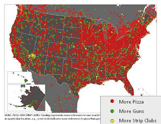
More Pizza, More Guns, More Strip Clubs

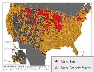
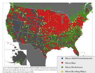
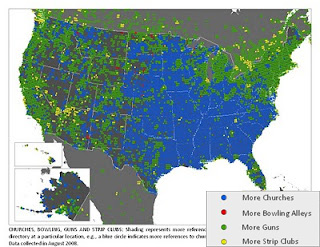
There’s probably a perfectly reasonable explanation behind every one of these data points, aside from paying customers, but until someone figures them out, enjoy generating your own theories about this collection of maps from Floating Sheep.  Each shows the prevalence of various public venues in the landscape of American culture based on results from the Google Maps directory.

Click the map for a larger version, click the match-up for the original Floating Sheep post:

[Bars vs Grocery Stores] [Adult Ent vs. Bars vs. Books vs. Bowling]
[Pizza vs. Guns vs. Strip Clubs] [Church vs. Bowling vs. Guns vs. Strip Clubs]

Find more maps and fun at Floatingsheep.org.

We’re Not Going To Take It and It Would Help If You Didn’t Either

It’s easy to do what everyone else is doing and eventually we might find out that’s been our only problem all along.  If you question how different daily life could be, witness what one artist and a 90 piece marching band were able to do in the city of Denver.

Now imagine what kind of show 7 billion people could be putting on if everyone wasn’t so busy taking it.

[from Lee Walton‘s Playing Apart] [See also: 7 of 27]
1 2 3 4 8