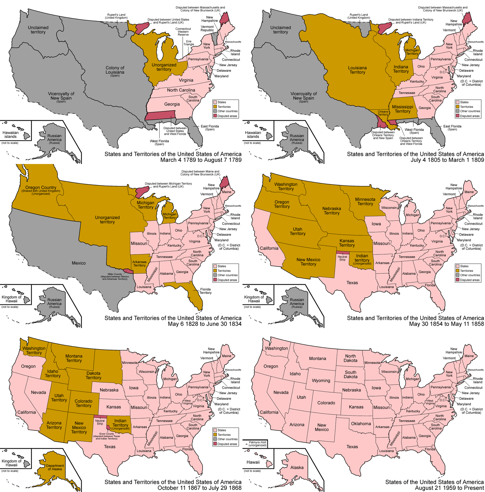
So, …Â what’s next?
[via Smithsonian Magazine; check out NationMaster for the play-by-play account]When looking at median gross rents, the extremes get washed out as location, location, location turns into everywhere.  In 2010, the U.S. median gross rent was $842/month, up from $602 in 2000. For some perspective on the change, here’s a look back at the last few decades, with and without adjustments for inflation.


Now breaking it out by state and county with data from 2000, location begins to return as a factor.
But if you live in a big city, these rents might seem completely divorced from reality. To make sense of urban rents, you have to move the cutoff up to 2.5x the median.
On the other hand, below you can find out where people would likely choke at the thought of $1,500/month rent.
While the percentages seem to favor cheap rent, remember that 1% of Los Angeles, the most populated county, is larger than the population in 81% of the other 3,220 counties in the U.S.
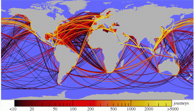
[Historical rents and 2000 Median Gross Rents map (pdf) from the U.S. Census Bureau; $1,500/$200 maps from StatJump]Last week we looked at world trade from the angle of who and what. This week we consider part of the how.
First, a little perspective on shipping by way of Spanish, Dutch and English routes from 1750 to 1855. Each line represents a voyage based on the ship’s log book.
How do we roll float these days? As you might guess, we’re not so much for the squiggly lines anymore.
Trees. They’re great, until they’re in the way. Forests once covered half the land on Earth and now claim less than a third of it. Why might we care? Here’s NASA with a few reasons:
Trees cool and moisten our air and fill it with oxygen. They calm the winds and shade the land from sunlight. They shelter countless species, anchor the soil, and slow the movement of water. They provide food, fuel, medicines, and building materials for human activity.
Modern life is great at detaching us from our natural surroundings. While the paragraph above contains words like ‘oxygen’, ‘soil’, ‘water’, ‘food’, ‘fuel’ and ‘medicine’, which on The $100,000 Pyramid could elicit “Things Critical To Human Life”, it still doesn’t necessarily make the connection. We know we need trees. That’s why we’re using them.
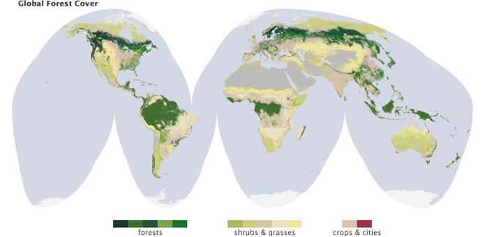
Thanks to a six year collaboration between the Woods Hole Research Center, the U.S. Forest Service and the U.S. Geological Survey, we now have very detailed knowledge of the state of biomass in the United States. 4 pixels per acre to be exact…
It’s good someone is paying attention. Don’t think for a second we couldn’t chop every one of them down. (Think buffalo.) Now with the tree inventory, we’ve hopefully got what we need to carve out a future without it falling down all around us.
[Maps from NASA 1, 2, 3 via Geek.com]If you need a break from filling out your 1040, look no further than xkcd’s /1040/, which happily has nothing to do with taxes despite the timing…
37.5 million Americans moved during 2010. 4.3 million changed states.
Find out where your neighbors went and who took their place…
For contrast to Brooklyn’s traffic, check out some rural counties.
[Migration Map from Forbes] [Related: To and Fro, Internationally]Ever thought about getting out of Dodge in a big way? Looking for ideas? At MigrationsMap.net, you’ll find a handy world map of information on where your fellow citizens have gone to and the origins of those who took their place…
The data comes from the Global Migrant Origin Database and gives a rough estimate of migrant populations circa 2000. There were an estimated 175M migrants worldwide as of 2000, up from 75M in 1960. But that’s only an increase from 2.5% to 2.9% of the total world population, which went from 3 billion-ish to 6 billion-ish in those same 40 years.
Anyway, here’s the list of lines that more than a million people have crossed, with the U.S. starting and finishing it off.
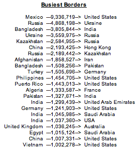
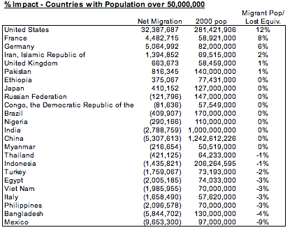
Pulling the full data set and counting up the complete totals for each country, the United States once again tops the list in positive net migration at 32.4M, with Mexico on the negative end of the spectrum at -9.7M.

But the impact of these numbers depend on the total population of each country. Considering only countries with populations over one million, the United States comes in 15th in terms of migrant population as a percent of total 2000 population. Meanwhile, Mexico falls just short of the list in regard to percent of population lost against the total population had no one left.

And finally, here’s the stats on all 24 countries with a population over 50M as of the 2000 censuses.
There’s a story behind every number on here. Hopefully once we get all the numeric data visualized, the next wave of visual representations will work to connect the data to those stories. We have so much data, but so little reference for it.
  |
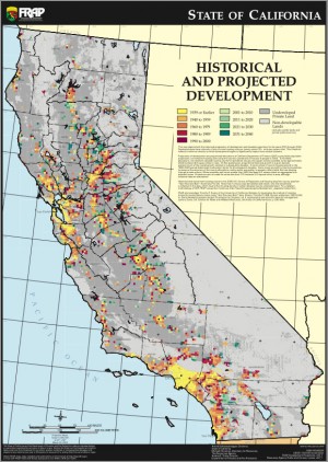  |
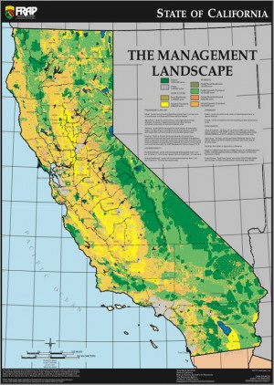
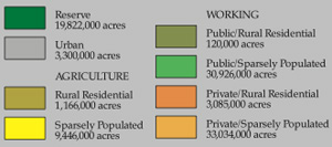
[Click on the maps to get a little closer or check out the full PDFs and more at FRAP maps]