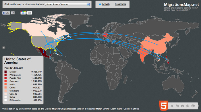
Ever thought about getting out of Dodge in a big way? Looking for ideas? At MigrationsMap.net, you’ll find a handy world map of information on where your fellow citizens have gone to and the origins of those who took their place…

The data comes from the Global Migrant Origin Database and gives a rough estimate of migrant populations circa 2000. There were an estimated 175M migrants worldwide as of 2000, up from 75M in 1960. But that’s only an increase from 2.5% to 2.9% of the total world population, which went from 3 billion-ish to 6 billion-ish in those same 40 years.
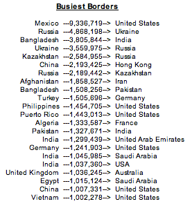
Anyway, here’s the list of lines that more than a million people have crossed, with the U.S. starting and finishing it off.

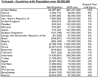
Pulling the full data set and counting up the complete totals for each country, the United States once again tops the list in positive net migration at 32.4M, with Mexico on the negative end of the spectrum at -9.7M.

But the impact of these numbers depend on the total population of each country. Considering only countries with populations over one million, the United States comes in 15th in terms of migrant population as a percent of total 2000 population. Meanwhile, Mexico falls just short of the list in regard to percent of population lost against the total population had no one left.

And finally, here’s the stats on all 24 countries with a population over 50M as of the 2000 censuses.

There’s a story behind every number on here. Hopefully once we get all the numeric data visualized, the next wave of visual representations will work to connect the data to those stories. We have so much data, but so little reference for it.

