You Can Pick Your Friends and You Can Pick Your Nose, But More Than Likely You’ll Just Vote Democrat or Republican

Still months away, the 2012 U.S. presidential election is already shaping up to be a real chore/bore.  It’s as if we used up every bit of inspiration in 2008 and are now left to vote along party lines that are neither fun like a party nor straightforward like a line.

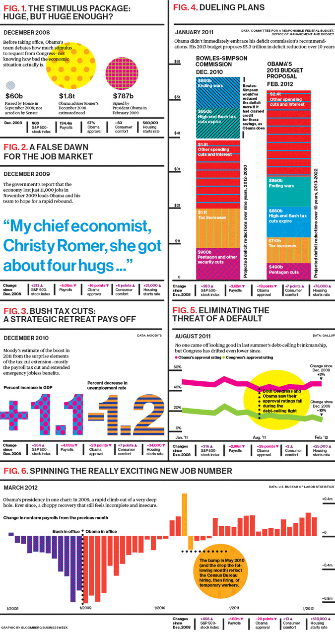
With the economy, it’s difficult to imagine either party promoting themselves, but given the likelihood that they will, here’s Businessweek’s recap of Obama’s efforts to straighten the ship

(click for full size version)

Now we just need a chart on how this relates to reality.

What Have You Been Up To?

What do you remember from your day to day?  Can you recall what you did last year, last month or last week?  Nicholas Felton, aka Feltron, knows.  No, he doesn’t know what you did, but he knows exactly what he has been up to and since 2005 has shared the results in the Feltron Annual Report.

For more on the subject, we turn to Roman Mars and the 99% Invisible radio show

Below we have the on-the-ground report of Feltron’s 2008 comings and goings.  Open up his Annual Report archive in a new window to explore while you listen…

(click to jump into the 2008 report)

[Feltron.com via 99% Invisible; Thanks, Timothy!]

Would You Like Your Receipt?

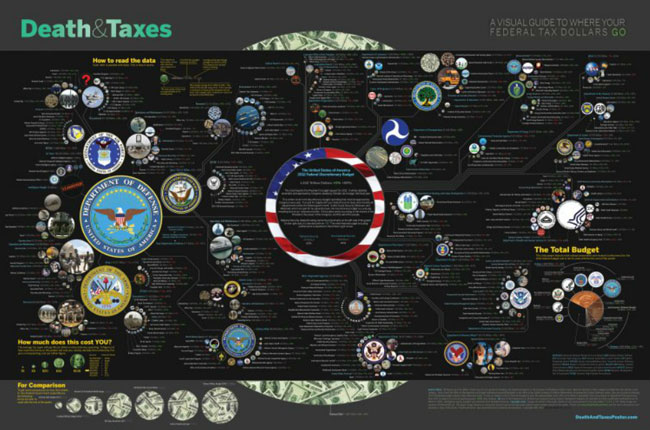
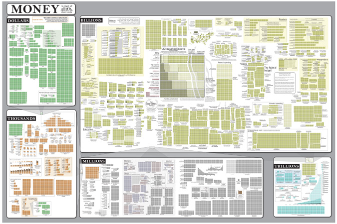
Updated for its fourth year, the Death & Taxes: 2012 infographic is back and ready to answer all some of your federal tax withholding questions.

(click to explore)

The focus of the chart is discretionary spending (ie. what Congress must vote on each year) and includes figures from the President’s Budget for 2012, along with percent change from 2011 and 2002, respectively.  It’s a dense presentation, but $1.242 Trillion is a lot of dough.

[Death & Taxes]

The Two for Tuesday Coffee Break

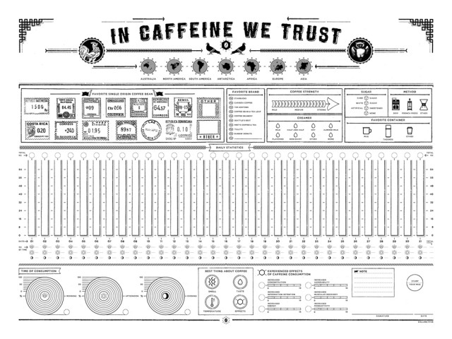
Looking for something to track this month that doesn’t involve you eating better or exercising more?

Better understand your caffeinated ways with this DIY print from Column Five Media, on which you can paint the results using your coffee.  If your wallet is light (and your eyes are good), you can try working with this preview image and check out their blog for clues on what you can’t read.

Meanwhile, if you’re not the tracking type, Coop is here to let you in on a little secret that can make a difference every day of the year.

[Chart via Laughing Squid]

Step 1: Counting Abstract Objects

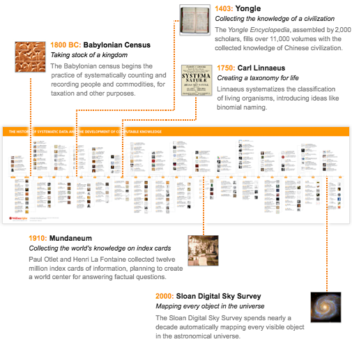
It wasn’t just crickets and then computers.  Civilization has been wrestling with data since the start.  Do a Google search and you’ll find that we’re still struggling to get a handle on what we know.  Perhaps it would help to consider our approach historically.  Wolfram|Alpha has prepared a special timeline of computable knowledge for just such an endeavor…

(click to explore the timeline)

[Advance of the Data Civilization: A Timeline via Stephen Wolfram|Blog]

The Illusion of Choice for a New Generation

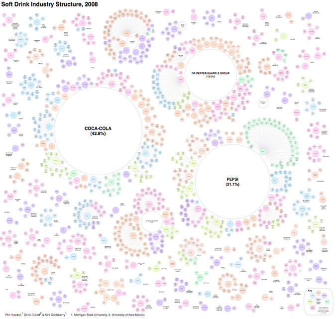
The formula for soft drinks is pretty simple, which might explain why there are so many of them on the market.  Water + a Sweetener + a Flavoring Agent = Good Margins.  Add in caffeine and fruit juice as needed.

The following chart, however, is called The Illusion of Diversity for a reason.

(click to zoom in)

It’s generally known that Coke and Pepsi are a big part of the industry, but what isn’t clear from all the choices above is that, along with the Dr. Pepper Snapple Group, the top three firms account for 89% of soft drink sales in the United States.

[via Visual Complexity] [more food and beverage-related infographics from Philip H. Howard at Michigan State University]
1 2 3