How Average is Your Income?

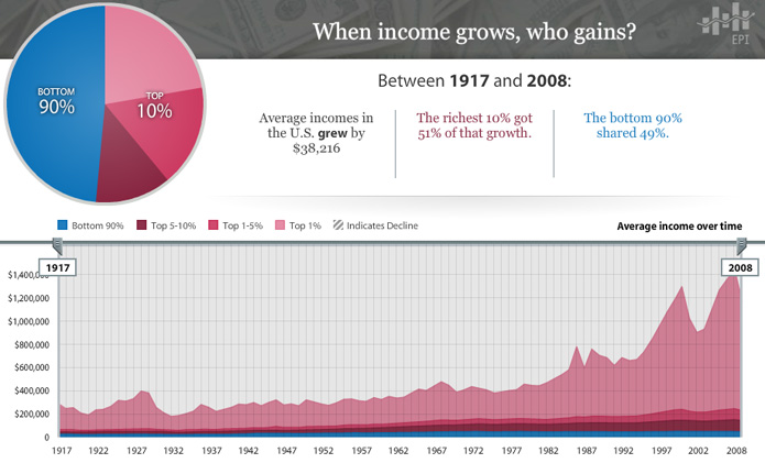
With the Economic Policy Institute’s interactive chart of average incomes in the U.S. between 1917 and 2008, it is easy to lose focus as your eyes shift from one baffling number to the next.  In the time that it took to go from radio to the internet, average incomes only grew by $38,216?  …  And that growth was split 51%/49% between 10% and 90% of the population?

There’s no end to the configurations you can explore in the chart and all of them lay out the story in a different way.  For instance, here’s a stroll through the data by decade that is a real tearjerker.

Oh, things have changed alright.

[EPI’s The State of Working America chart via The Atlantic]

A Scenic Overlook for World Trade

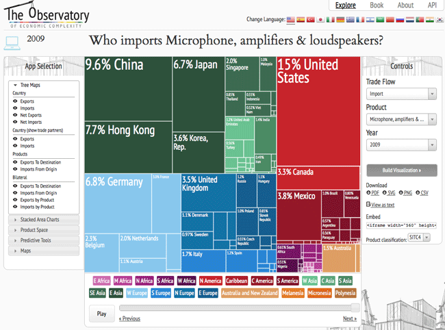
The Observatory of Economic Complexity is a simple thing.  It’s a tool for exploring the world via countries and the products they trade.

It’s also a tool that has come a long way in a year.  Now you can embed an interactive chart of the United States’ imports anywhere…

Or go to their site and dig deeper into the specifics with bountiful options…

You can find out about who has and who wants everything from coarse animal hair to armoured fighting vehicles.  The only things missing are the whys and wherefores…

From Big Bangs Come Big Histories

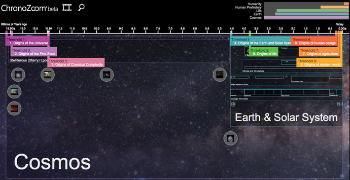
Between the beginning of our universe and the present moment lies 13.5 billions years and so much data that the Information Age hasn’t even put a dent into it yet.  Not only did Earth not come together, literally, until 9 billion years after the party started, we, relatively speaking, just showed up a few moments ago.  That’s a lot of inside jokes we’ve missed out on, not to mention all the other universes or unknown entities potentially beyond our present understanding.

Despite the disadvantage, the field of Big History was born in the 1980’s with the simple goal of studying history from the beginning of time to the present across multiple disciplines of knowledge.  How’s it going so far?  Judge for yourself by checking out ChronoZoom, a collaboration between Microsoft Research, UC Berkeley and Moscow State University.

(click to explore ChronoZoom)

While visually impressive, you might still wonder where you are going to find the time to dive into such a study or why you should even care given that you haven’t filed your taxes yet, but perhaps Bill Gates will one day save up enough money to give us all a couple of days off for such a purpose.  Until then, more information can be found at the Big History Project and from David Christian’s TED talk on the subject.

[via Flowing Data] [Related Posts: Carl Sagan’s Cosmic Calendar, Get Your Perspective On]

Get Your Perspective On

Got big plans for the weekend?  Maybe taking a short trip?

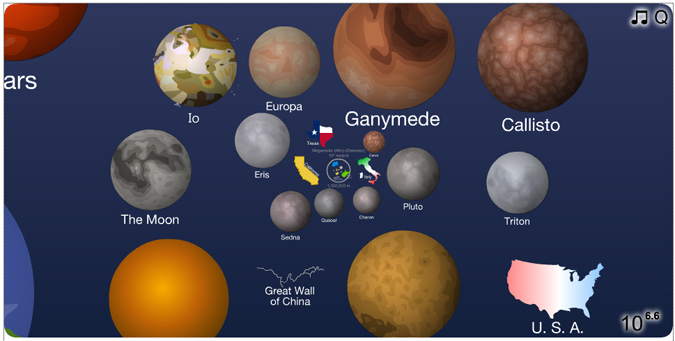
Then, here’s a golden opportunity to put it all in perspective.  Click the image to launch a wonderful presentation that will make you feel utterly small and overwhelming gigantic one after the other…

(click image to launch)

[The Scale of the Universe 2 by Cary Huang; Thanks, Andy!]

BFFs: A Look Through the Fannie Maze

In 2008, two institutions with profoundly unfortunate names were taken over by the federal government.  Known as Fannie Mae and Freddie Mac, they owned or guaranteed half of the entire U.S. mortgage market at the time and their subsequent rescue represented “one of the most sweeping government interventions in private financial markets”… “in decades”.

Who were the captains of this Titanic?  Who let them behind the wheel?  Though not the most glamorous of posts, as government-sponsored enterprises, they were unsurprisingly stocked with people who were in the government.  Below we have a venn diagram (one from a larger set created by geke.us) showing a selection of people from both sides of the fence equation.
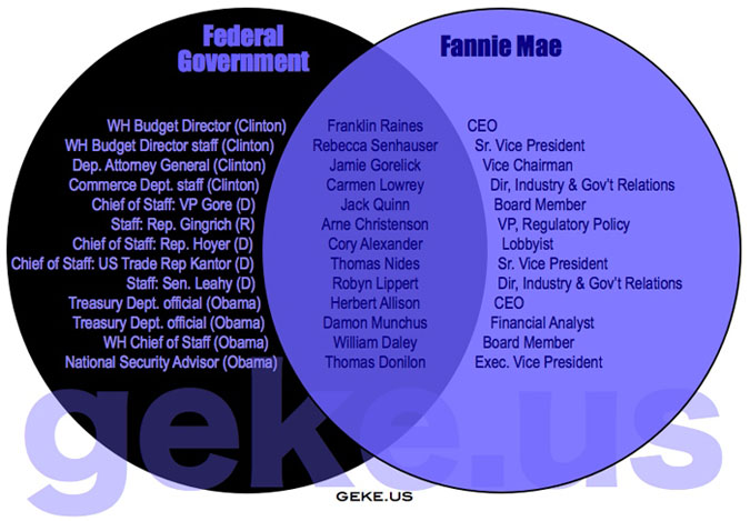
(click for venn diagram collection)

That’s the tip of the iceberg though.  Let’s see who on this list comes up in the NNDB Mapper, a very fun tool for mapping the links between people, companies and events ranging from Rihanna to the Funeral of Richard Nixon.
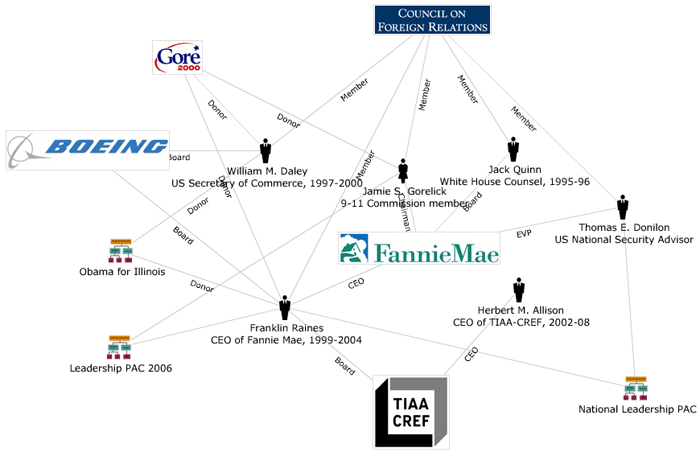
(click for NNDB interactive version)

Okay, we got 6 out of 13.  Above we have the connections they share.  Now let’s look at everyone associated with Fannie Mae.
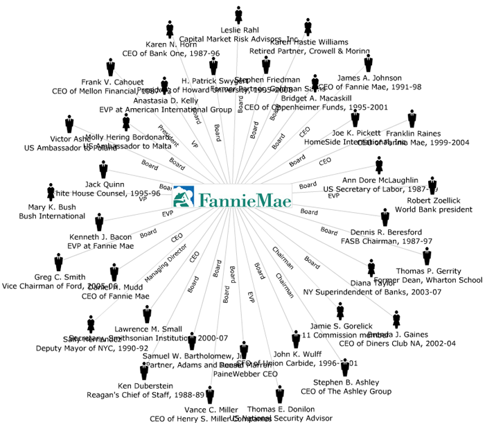
(click for NNDB interactive version)

Mainly board members and CEOs.  But what happens if we blow out all of their nodes?
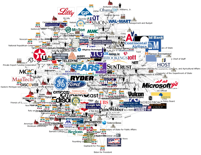
(click for NNDB interactive version)

We get a picture.  A picture of the myriad influences and connections that led to a spectacular failure.

The End.

[Venn diagram via Infoplasm]

U.S. Newspapers in the Fourth Dimension

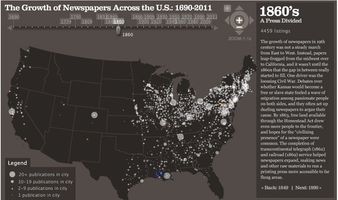
See how the light spread from sea to shining sea…

(click for interactive map)

Those spots of color are papers in different languages.  Maybe next someone will make one of these where the holdings of the media conglomerates are shaded in by owner.  MediaOwners.com would be a great place to start for such an endeavor.  (Or has it already been done?  Please comment if you know.)

Meanwhile, you can probably follow some of the dots’ comings and goings by cross-referencing this chart of historical U.S. metropolitan area population rankings.

[Map by Stanford University’s Rural West Initiative via visual.ly]

Turning What-If’s Into When’s

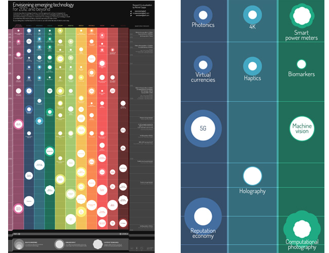
Is it just a matter of time?  Forget your lack of a flying car for a moment and enjoy a speculative look at the future of technology between 2012 and 2040…

(click to view)

Will 4K make today’s movies look like relics by the end of the decade?  Can the utility fog turn us all into Green Lanterns?  And cross your fingers for the 2020 arrival of the Reputation Economy, Ape Con Myth’s favorite, where in a post-scarcity state, “all the necessities (and most of the luxuries) of life are free for the taking,” leaving our reputations as the only guide to our worth.

Dare to dream.

[Chart by Michell Zappa via Visual Complexity]

You Need a New Dictionary

posted in: External Viz, Smog 1

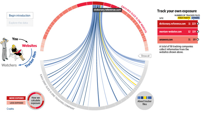
One of the many things you’ll find out from the Wall Street Journal’s What They Know series is that you need a new online dictionary. In their study of tracking files distributed by major websites, dictionary.reference.com (aka dictionary.com) topped the rankings by passing on an absurd 234 tracking files to its visitors in the name of 40 companies who want to know more about people who use the dictionary.  Merriam-Webster, whose auto-play videos should be punishment enough, came in second with 131 trackers.


So the next time you look up bullshit in the dictionary…

Wikipedia is your only safe bet when it comes to what Google is going to serve up first, though Wiktionary would be the appropriate option. Not only is Wikipedia the most popular website without ads, it is the only one of the top 50 sites not installing a single tracking file on your computer. Check out What They Know to find out which sites lie in-between.

[via Visual Complexity]

The Fortunes of the Fortune 500

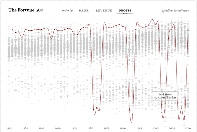
As far as charts featuring revenue and profit go, this is about as good as it gets.

(click the image for interactive Fortune 500 fun!)

Ford is just one of over five hundred stories found in this data set.  Clicks and arrow keys will guide you through 55 years of bottom lines for America’s largest corporations.  Ford, despite what you see above, spent the majority of the time ranked around #3, never taking the top spot and only falling as low as #8 in 2010.

[Chart from Fathom via Flowing Data]

Related: Historical U.S. Metro Area Population Ranking

1 2