The Tao Jones Revisited

Previously Ape Con Myth explored the history of the Dow Jones Industrial Average through the lens of the Tao Te Ching in a project known as The Tao Jones.  Given the recent activity in the market, we have returned to that work to seek wisdom, or at least some perspective and an update on a couple of charts…

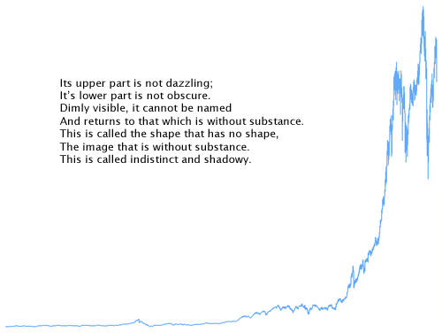
On day one, May 26th, 1896, the Dow closed at 40.94.
Yesterday, 31,246 trading days later, it closed at 11,236.77.
What happened in-between?  Here’s everything:

(click to enlarge)

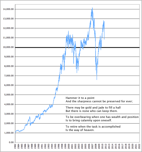
While there was plenty of drama beforehand, below we zoom into more recent history, starting in 1982 when the Dow left the 1k threshold behind after 18 years of bouncing between 800 and 1,000.  Taking the powers of ten as developmental milestones, the Dow is currently working to leave 10,000 in the dust.  It first crossed the line on March 29th, 1999.  Since then it has recrossed that line 34 times, the last just under a year ago on August 27, 2010.

Don’t be surprised if it has to again.

(click to enlarge)

Yet, all hope is not lost!  Although they currently put the Dow around 9,500, Ape Con Myth’s ‘not-to-be-considered-investment-advice’ projections say dawn will break in mid-2013, with 30,000 waiting for us by the end of the decade.

But don’t rush to the end, start at the beginning

To Work or Not To Work, That’s a Question?

How many people does it take to make the not-so-merry-go-round go round?  If you’re talking about the United States economy in 2007, which we are, then the answer is 146,047,000 people, or … wait for it … 48.4% of the population.

Did you think it would be more?  Either way, it certainly brings new meaning to the next logical question: How does the other half live?

Let’s look at some basic numbers:

As you would expect, kids and the retired account for much of this other half who magically don’t have jobs, though there are about 50 million working-age wizards out there.  It’s interesting to know whether they want a job or not, but isn’t the real question, do they need one?

Meanwhile, ‘Civilian Noninstitutionalized Population’ is one of the creepier ways of speaking about people over 15 years old who aren’t in the military, prison, a nursing home, etc.  How about Civilian Labor Force Pool or simply People Who Can Work?

While the Institute for the Study of “Making a living” will continue to explore how the noninstitutionalized do and don’t make ends meet, ACM’s take-away is that it didn’t take everyone to create the world’s largest economy in 2007.  The next question is, how many of those jobs were mission critical?

Which mission?  We will consider a few.

Regarding Your Lack of Privacy Online

posted in: Commentary, Features, Input, Smog 0

What is a bigger waste of time: Surfing the internet or keeping track of what each individual surfs on the internet?

Tucked quietly away in Section 4 of H.R. 1981, a provision lurks that turns what should have been a no-brainer bill both parties could agree on into a way to track every U.S. internet users’ activity for the last 18 months. And despite the recent spree of data breaches in the both the public and private sectors, subsection (b) amusingly calls for this data to be stored securely.


No worries if you don’t have anything to hide?  You are five steps from having something to hide:
1. Pick any of your social/political/religious beliefs.
2. Note that there are people out there who think you are wrong.
3. Consider the odds those people could attain a position of power in your life (family, boss, police, government).
4. Image those people getting really pushy about things they don’t like.
5. Go visit a website about your belief.

We all have a reason to hide if the wrong people are looking.  And why stop with internet activity?  Storage is cheap, let’s make the phone company record every conversation.  While we’re at it, you’re probably sitting in front of a video camera reading these very words.  Mind if we record your expression for posterity?

Say cheese.  Then go tell your representative this bill takes one giant leap too far.

Google’s Six-Front War Visualized

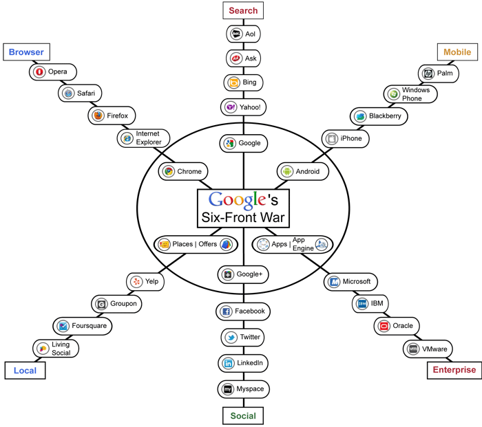
Inspired by the launch of Google+, here’s a visualization of some of Google’s competition, as laid out in the TechCrunch piece, Google’s Six-Front War:

(click for larger version)

Of course, that leaves out video/photo hosting, blogging, desktop OS, music, TV, eBooks, driverless cars, philanthropy, other stuff we know about and whatever we don’t know about yet.

How is Google doing in all of these battles?  For the more mature products in the top half, very well.  In Search and Mobile, they are number one.  Among browsers Chrome is in third place, moving in the right direction.  It’s the bottom half where Google has their work cut out for them.  Google+ is estimated to have brought in 10 million users in the first two weeks with a chance of doubling it by the weekend.  Although that only amounts to 1-3% of Facebook’s crowd, it nonetheless puts Google+ at about 7th place in the Social sphere right out of the gate.

Let’s the games begin!

Update: How’s Google+ doing a month later?  While this ranking puts it in 6th place with 32 million users, it would seem that the honeymoon is over, due largely in part to Google’s awkward stance in the “real names” vs. pseudonyms debate.   After years of using Google products pretty much any way we want, suddenly there is a rule that has left an unknown number of deleted profiles in its wake. Meanwhile, Google is facing some serious challenges in the patent wars and falling behind in at least one stat related to their crown jewel, search.  My, how quickly the weather can change…

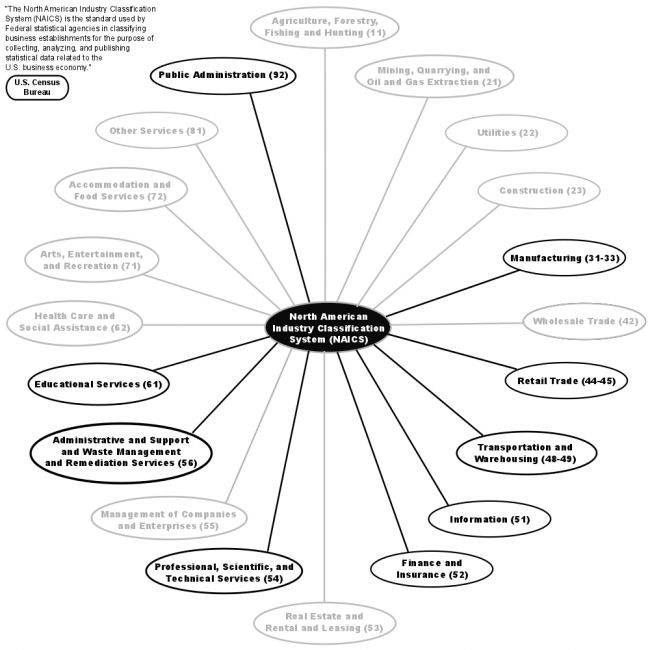
GDP by NAICS (or, Here Come the Numbers)

Here we go again, but this time all 20 economic sectors link to a first round mapping. Also, U.S. GDP figures have been added to the top level and will be trickling down over the next few weeks…

The chart below is live, or you can go to the full page version.


Plan for the Temporary Relocation of All U.S. Residents

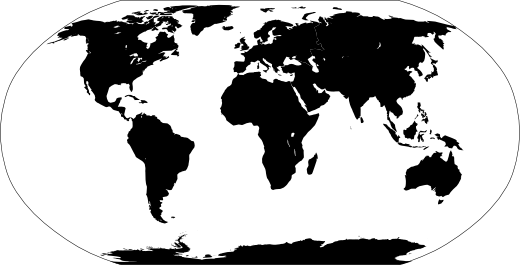
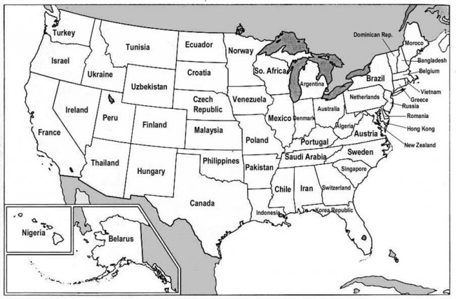
In response to continued economic hardship, Ape Con Myth recommends that the entire population of the United States take a vacation as soon as possible. Please refer to the map below to find your destination.  Each state has been assigned a foreign country with a comparable GDP.

USstatesCountryGDP

To complete the exercise, write a short essay on what your home state could learn from its economic counterpart, and vice versa.  Airlines are asked to provide pen and paper to all returning travelers for this purpose and to forward the collected works to Ape Con Myth for processing.  Wikipedia is an acceptable substitute for those who can’t afford the trip.  Your essays are welcome in the comments.

[Map via Big Think‘s Strange Maps; Thanks to scribblesabit]

One of These Things is Not Like the Others

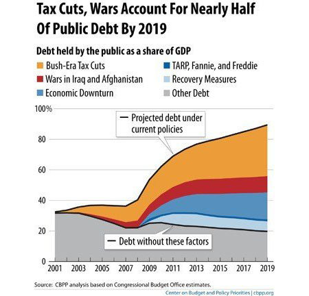
Before we get to the chart, let’s refresh ourselves on the drill…

Okay, now look at the chart and pick out what’s different…

Did you pick the Bush-Era Tax Cuts?  Then you’re absolutely right!

Unlike wars, downturns, bailouts and recoveries, we can project the direct financial effect of tax cuts before the fact.  Everything else on the subject is speculation.  At this point, that there is still a debate about it at all points to much deeper problems.

[Chart via GOOD]

Global Water Summary Info

It’s too bad UN-Water didn’t make it in our initial Google results for “water” (it’s the 64th result) because if you have a few minutes and a desire to understand the global water situation, the links to all the information you need are on one page.

In addition to their statistics page, UN-Water has three flagship publications:

What’s the story?  From skimming 500 pages of pdfs, it was largely what you’d expect.  Developing countries are making progress, but have a long way to go.  Increasing populations, advancing economies, climate change and lack of information, communication and funding are just a few of the factors involved.  Billions of people are still without the basics and while Africa and Asia house the areas furthest behind, there’s plenty of trouble spots in the most developed of countries and economies.

Although the challenges are great, it is important to remember that this is not a problem in search of a solution.  For the most part, it is a lame-duck problem waiting for the implementation of solutions already in hand.  That’s why the World Water Development Report focuses our attention on decision-making:

That’s the finish line for this week’s water sprint.  Next steps include digging into some country-level data, where we’ll really start to see what the hold-up is, and updating/expanding on our first water map.

The Self-Employed: Same As It Ever Was?

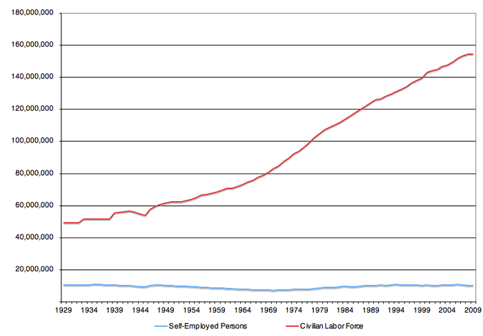
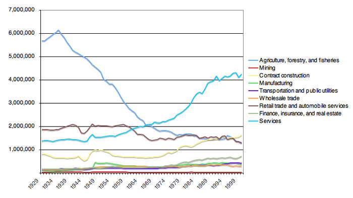
According to the Bureau of Economic Analysis, the self-employed consist of “active proprietors or partners who devote a majority of their working hours to their unincorporated businesses.”  Another thing the BEA says is that, despite the civilian labor force tripling during the same period, the number of self-employed persons in the United States has remained fairly constant over the last 80 years.

SelfEmployedVSLaborForce

The only thing that has changed is industry composition…

Where we once had farmers, we now have service providers.  But does that explain why the self-employed went from 21% the size of the labor force down to 6%?  Do we have fewer independent operators in the economy or are more of them  turning to the corporate or LLC structure to protect themselves from the modern consumer?

[Self-Employment data via BEA NIPA Tables 6.7A-D; Civilian Labor Force figures from ERP B-35]

1 2 3 4 5 6