Like never before, you’ve got alternatives…
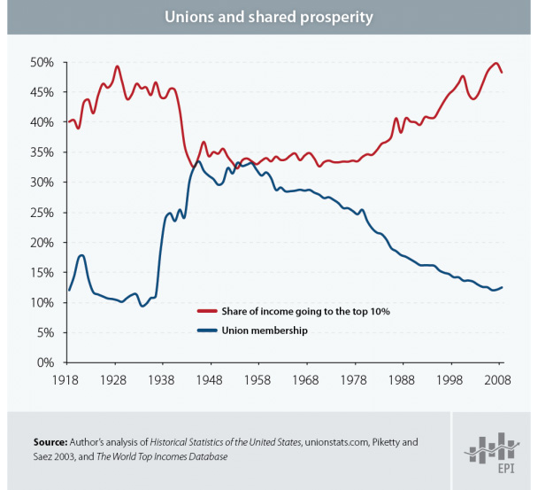
With the Economic Policy Institute’s interactive chart of average incomes in the U.S. between 1917 and 2008, it is easy to lose focus as your eyes shift from one baffling number to the next. In the time that it took to go from radio to the internet, average incomes only grew by $38,216? … And that growth was split 51%/49% between 10% and 90% of the population?
There’s no end to the configurations you can explore in the chart and all of them lay out the story in a different way. For instance, here’s a stroll through the data by decade that is a real tearjerker.


Oh, things have changed alright.
[EPI’s The State of Working America chart via The Atlantic]Back in 1880, if you weren’t a farmer or a laborer…
Actually, if you lived in the United States back in 1880, you were probably a farmer or laborer. Or a domestic servant.
That is, if you had a job in the first place.
For more shop talk from the 1880 Statistical Atlas of the United States, check out the more rarefied occupations in trade and transportation and manufacturing and mining or learn more about your future past in agriculture and professional and personal services.
How many countries does it take to screw in a light bulb manufacture the packaging for a television?
 (click image for interactive map)
Magellan would be proud.
Explore Sourcemap to find out the international cooperation going into iPhones, Ben & Jerry’s, Chicken of the Sea Light Tuna and more!
From Gresham’s Law:
Here we present a history of the Fed in charts. As you’ll surely glean from the below — the Fed has degenerated from a by and large passive institution (dealing only in high-quality self-liquidating commercial paper and gold) to an active pursuant of junk, an enabler of wars, a ‘benevolent’ combatant of the depressions of its own creation, a central planner of employment & prices and of course a forgiving friend to inconvenient market follies.
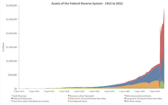
If you understood any of that, you might enjoy the accompanying decade-by-decade survey of the Fed’s assets. Everyone else can join us in hoping that someone understood it.

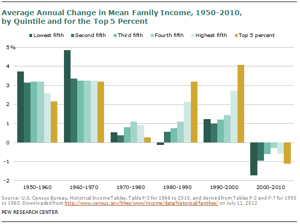
Who would have thought we’d spend the first decade of the 21st century making the 1970s look good. Everyone not shouting “I told you so!” should check out the rest of the Pew Research Center’s report: The Lost Decade of the Middle Class – Fewer, Poorer, Gloomier.
15% of all the income earned in the United States is up for the taking. That is, the top 10% of earners are happy to take it home, but they will give it up if asked properly…
What is the creeping menace shown in the haunted chart below? It’s the amount of high frequency trading in the stock market from the beginning of time January 2007 through January 2012…
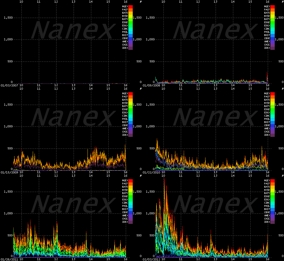
Each color stands for a different U.S. stock exchange and the x-axis lays out the hours of each trading day, from 9:30am to 4pm EST. What is it supposed to look like?  There is no correct answer, but the key is to notice that this phenomenon barely shows up in 2007 and initially only involved spikes at the open and the close of each day. … And then it just kind of goes nuts. … Much as it did last week when Knight Capital Group’s high frequency trading monster program went rogue and couldn’t be shut down for half an hour.
What kind of effect can one company’s trading program have?
A New York Times analysis of New York Stock Exchange volume on Wednesday morning showed that during the first minute of trading there was 12 percent more trading in all stocks than there had been on average during the previous seven days. By the third minute of trading there was 116 percent more trading than the previous week’s average. The difference reached a peak at 9:58 a.m., when the volume was six times greater. After that, trading volume fell off sharply, nearing the recent average at 10:15 a.m.
Now, where is it that we’re supposed to put all of our money for retirement, you know, to keep it safe?
[Chart from Nanex via Felix Salmon]As a counterpoint to Olympic medal counts, see how the nations of the world stack up in terms of innovation and, crowd-favorite, GDP per capita:
From the GII release:
For the second year running, Switzerland, Sweden, and Singapore lead in overall innovation performance according to the Global Innovation Index 2012 (GII): Stronger Innovation Linkages for Global Growth, published by INSEAD, the leading international business school, and the World Intellectual Property Organization (WIPO), a specialized agency of the United Nations.
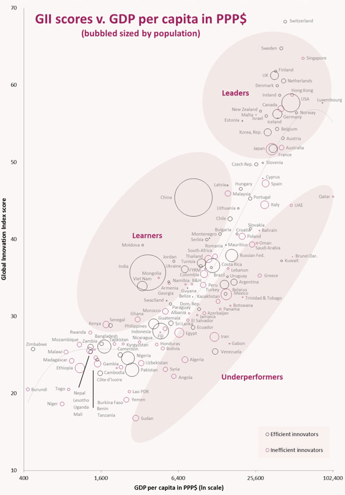
You can see why they put the one on tv and not the other.
Go team.
[Chart from The Global Innovation Index via The Economist]After yesterday’s post about breaking up the banks and The Newsroom’s mention of U.S. economic performance under Glass-Steagall, Ape Con Myth decided to dust off The Tao Jones data set and take another look at the full history of the Dow Jones Industrial Average, from 1896 through last Friday.
This time we’ll look at 31,490 trading days using Glass-Steagall’s tenure as the yardstick…
(click the image to enlarge)
For more exploration of the Dow, check out The Tao Jones.