How Average is Your Income?

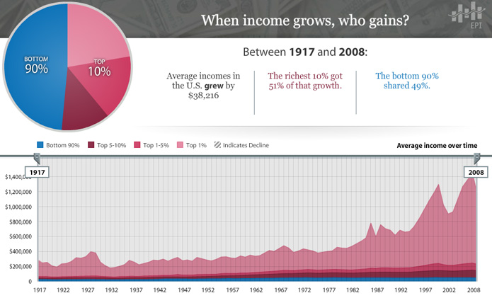
With the Economic Policy Institute’s interactive chart of average incomes in the U.S. between 1917 and 2008, it is easy to lose focus as your eyes shift from one baffling number to the next.  In the time that it took to go from radio to the internet, average incomes only grew by $38,216?  …  And that growth was split 51%/49% between 10% and 90% of the population?

There’s no end to the configurations you can explore in the chart and all of them lay out the story in a different way.  For instance, here’s a stroll through the data by decade that is a real tearjerker.

Oh, things have changed alright.

[EPI’s The State of Working America chart via The Atlantic]

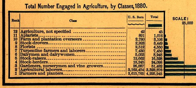
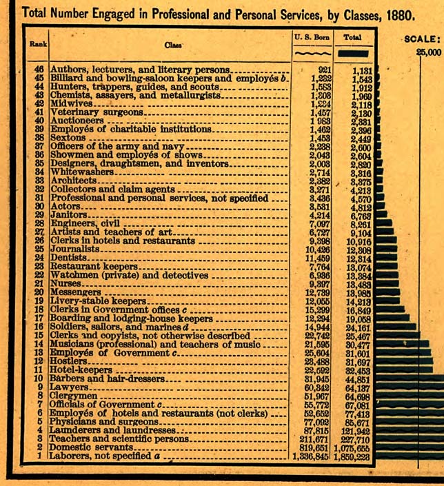
What Color is Your Parachute?, 1880 Edition

Back in 1880, if you weren’t a farmer or a laborer…

Actually, if you lived in the United States back in 1880, you were probably a farmer or laborer.  Or a domestic servant.

That is, if you had a job in the first place.

For more shop talk from the 1880 Statistical Atlas of the United States, check out the more rarefied occupations in trade and transportation and manufacturing and mining or learn more about your future past in agriculture and professional and personal services.

[Image from Brooklyn Brainery‘s A Handsome Atlas]

The Creepy Parallel Universe Known as Our Past

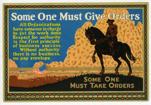
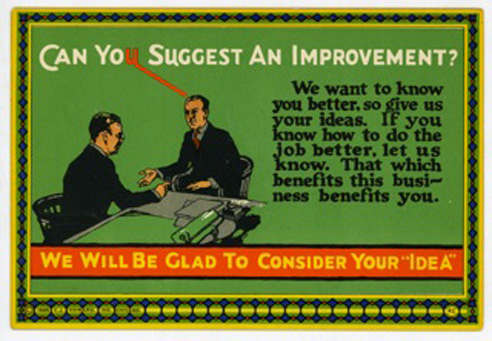
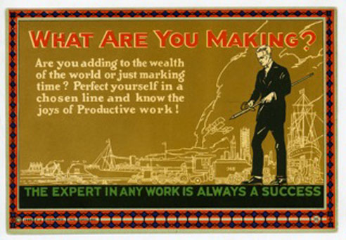
No matter who you are or what you do, you’ll likely join the rest of us in breathing a sigh of relief for not being born any earlier than you were.  As Vonnegut put it in Cat’s Cradle, “History! Read it and weep!”  And weep is what you might do looking through this collection of vintage motivational cards from the early 1900’s.  While suggestive of ideas that might propel one to action, you can almost taste the condescension and extrapolate from it the working conditions that might have acted as the side dish to our past toiling.

As you return to your labor today, be thankful that its 2012 and not 1912, 1812 or worse.  And for all those reading from 2112, Despair, Inc. will give you a glimpse of how twisted things were in the early part of the 21st century.

[via imprint]

On Things One Will Not Get Without Asking and Might Not Get Even Then

15% of all the income earned in the United States is up for the taking.  That is, the top 10% of earners are happy to take it home, but they will give it up if asked properly…

[Chart from Economic Policy Institute via Bill Moyers]

Untitled Minimum Wage Post

Every once in a while you run into a page on Wikipedia that never quite came together.  It’s not a stub, but it’s far from complete.  ‘Economic issues in the United States‘ is one such page.  The edits still trickle in, but the page remains adrift.  The section on Cost of living is a particularly interesting read, starting off in one direction only to have the wheels fall off at the end.


Minimum wage is one of those things, but why?  Because the economy is a murky pool where it is easy to make correlations and often impossible to prove anything, especially what any one value will do to everything else when changed.  It’s perfect for humans since it allows everyone to make their point, even if no one really knows what is happening.

As for the first part, yes, paying employees more is one possible thing that might lead a business to raise prices.  But so are gas prices and food prices and prices in general.  Prices don’t wait until their year-end review to find out if they got a bump.  They go up and down as they please, but mainly up because the only measure is more.  There’s always someone raising prices and therefore always someone to point at and blame for your prices going up too.  It makes sense that wages get a turn, unless you want everyone to max out their credit and lose their home.

Now for that missing citation.  Would you say the minimum wage has not kept up with inflation over the past 30 years?
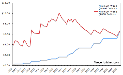
Almost, except for that first part there, the 80’s, where it didn’t at all and then the second part where it never caught up to the levels seen in the 60’s and 70’s.

The funny part though is how much drama surrounds the issue, once you start looking at the numbers.  Of the 139 million people employed in the civilian labor force in 2010, only 4.4 million (3%) were making at or below the minimum wage.  “Only 4.4M” because when the subject of minimum wage is brought up, you’d think the idea was to burn every business down.

Look closer and that 4.4M includes 2.1M workers aged 16-24 and 2.7M part-timers.  Look again and 2M work in leisure and hospitality (1.6M of that food services), 764K in retail and 425K in everyone’s favorite, education and health services.  Meanwhile, there’s all the cities and states that have set their own standards for living wages (some higher, some lower).

The federal minimum wage is a far more specific issue than it would seem and, apparently, what might be most at issue is the price of cheap, fast food.  If those kids didn’t make minimum wage, McDonald’s might cost as much as real food.  … Oh, never mind, it already costs more.  Two wrongs don’t make a right, but they can really turn out a profit.

In the end, if Wall Street can complain about their pay, everyone can.  (And perhaps they’re all right.)

It’s Not Just In Your Head

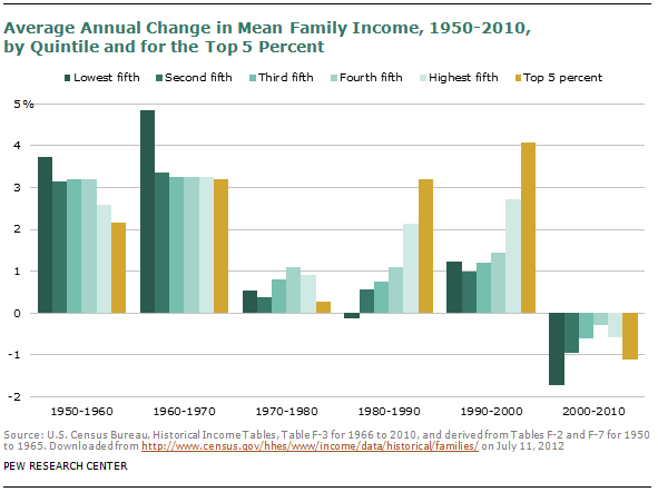
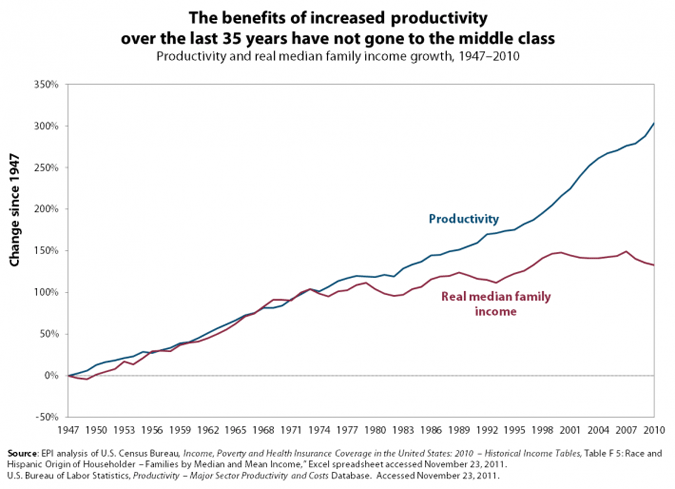
This one explains itself…

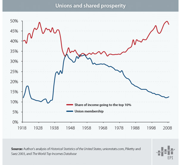
If you’re looking for more charts of the like, search no further than the Economic Policy Institute‘s The State of Working America.  The one above is from their Income & Poverty category, which brings together two things that are supposed to cancel each other out.

As long as employees are considered expenses, as opposed to, say, investments, they will continue to get squeezed rather than appreciated.

[State of Working America chart via zunguzunga]

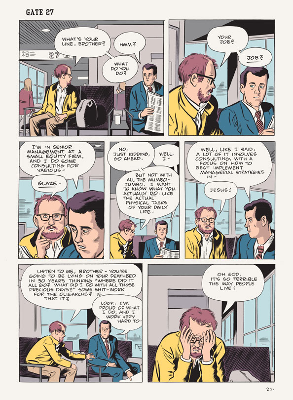
What’s Your Line, Brother?

From Daniel ClowesWilson:

Some Ivy League students are starting to agree with the sentiment after watching so many of their peers head off to work in consulting and finance after graduation.  From All Things Considered’s Stopping the ‘Brain Drain’ of the U.S. Economy

Student protesters recently got into a Goldman Sachs recruitment session at Princeton University to tell student attendees they were listening to a “carefully crafted recruitment pitch” and that they could “do better for society.” Similar protests have been held at Harvard University, and at Stanford University, where Teryn Norris was a student. …

“The problem is that when you’ve got 20 to 30 percent of some of the top talent in this country going into a sector that is not necessarily contributing to economic and social productivity,” he says. “That’s a problem for the country at large and it’s something that we should all be concerned about.”

Economist Paul Kedrosky agrees, except that we’re about two decades late in getting concerned.  He believes the current financial morass is the work of a long line of bright minds who decided to spin their wheels in the name of money, as opposed to areas like science, engineering and mathematics, a.k.a. the subjects many of them actually studied in school…

[Wilson is available from Drawn & Quarterly; NPR story via Hacker News]

It’s Never Enough

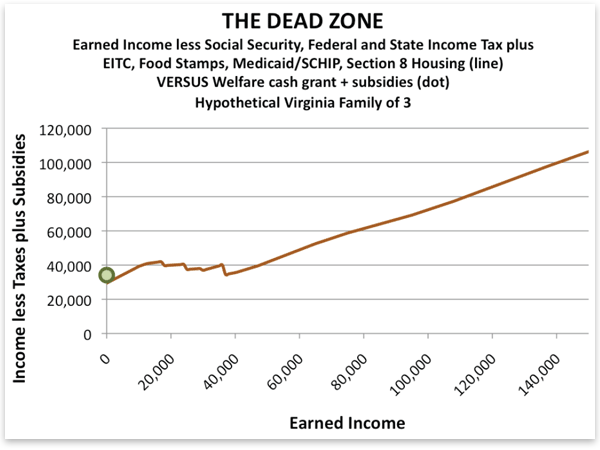
When one’s income increases, the tendency would be to expect standard of living to go with it.  In the following example, however, once you’re making $10,000 a year, you might feel just as poor making $40,000.

The issue is the balance of subsides and taxes on the lower income brackets.  The stagnation comes from the loss of social benefits as income rises.  Food stamps turn into grocery bills.  Free health insurance turns into… costly health insurance.

One way of looking at the situation, and the one taken by the Mises Institute, which made the chart above, is to say that by helping the poor, we are taking away the motivation to work.  And sure, when you find out low-wage work might leave you with less money than being unemployed, where is the motivation?  But, what’s the problem here: the helping of the poor or millions of full-time jobs that don’t pay enough to make ends meet?  Ape Con Myth’s take on the chart is that the base cost of life for hypothetical families of three in Virginia is about $40k.

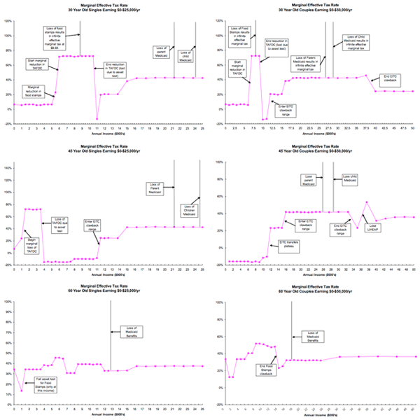
But that’s Virginia.  What about the country as a whole?  Below we have similar charts based on singles and couples at ages 30, 45 and 60 from a Boston University/National Bureau of Economic Research report.  Don’t worry about the fine print.  Just notice how different they all are…

(click to enlarge)

As the researchers were quick to point out, “the patterns by age and income of marginal net tax rates on earnings, marginal net tax rates on saving, and tax-arbitrage opportunities can be summarized with one word – bizarre.”

What do they think of our chances of understanding the elements at work?  “Thanks to the incredible complexity of the U.S. fiscal system, it’s impossible for anyone to understand her incentive to work, save, or contribute to retirement accounts absent highly advanced computer technology and software.”

Try doing that on a computer at a library.

[Mises chart and NBER report via Greg Mankiw via Kottke]

“Growth” in “Real” After-Tax Income

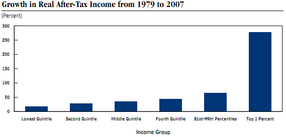
The Economist gave a nod to the 99% by way of some numbers from the Congressional Budget Office that make you go, “Ouch.”  Those are some tough percentages to defend.


But how do you stop it from being easier to make a lot of money when you have a lot of money?

[graph from the CBO’s Trends in the Distribution of Household Income Between 1979 and 2007 (PDF)]

To Work or Not To Work, That’s a Question?

How many people does it take to make the not-so-merry-go-round go round?  If you’re talking about the United States economy in 2007, which we are, then the answer is 146,047,000 people, or … wait for it … 48.4% of the population.

Did you think it would be more?  Either way, it certainly brings new meaning to the next logical question: How does the other half live?

Let’s look at some basic numbers:

As you would expect, kids and the retired account for much of this other half who magically don’t have jobs, though there are about 50 million working-age wizards out there.  It’s interesting to know whether they want a job or not, but isn’t the real question, do they need one?

Meanwhile, ‘Civilian Noninstitutionalized Population’ is one of the creepier ways of speaking about people over 15 years old who aren’t in the military, prison, a nursing home, etc.  How about Civilian Labor Force Pool or simply People Who Can Work?

While the Institute for the Study of “Making a living” will continue to explore how the noninstitutionalized do and don’t make ends meet, ACM’s take-away is that it didn’t take everyone to create the world’s largest economy in 2007.  The next question is, how many of those jobs were mission critical?

Which mission?  We will consider a few.

1 2