How Average is Your Income?

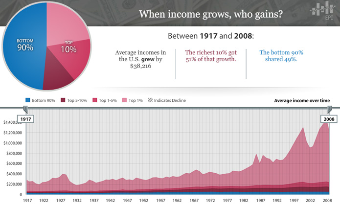
With the Economic Policy Institute’s interactive chart of average incomes in the U.S. between 1917 and 2008, it is easy to lose focus as your eyes shift from one baffling number to the next.  In the time that it took to go from radio to the internet, average incomes only grew by $38,216?  …  And that growth was split 51%/49% between 10% and 90% of the population?

There’s no end to the configurations you can explore in the chart and all of them lay out the story in a different way.  For instance, here’s a stroll through the data by decade that is a real tearjerker.

Oh, things have changed alright.

[EPI’s The State of Working America chart via The Atlantic]

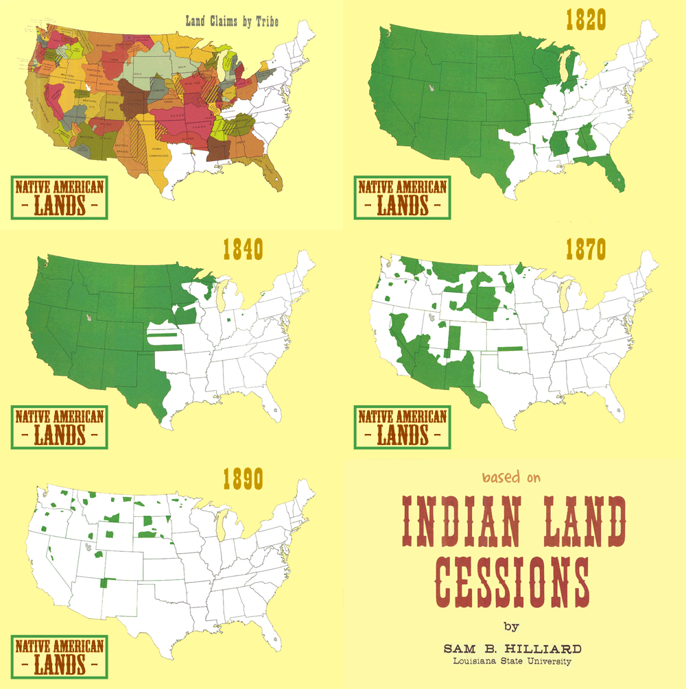
Indian Land Cessions (or Going, Going, …)

It plays out the same way every time…

To take a closer look, try the set of 67 maps collected in part two of the Eighteenth Annual Report of the Bureau of American Ethnology to the Secretary of the Smithsonian Institution, 1896-97.

[Animated gif by Somersaultr via Chart Porn]

More Pizza, More Guns, More Strip Clubs

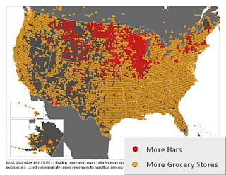
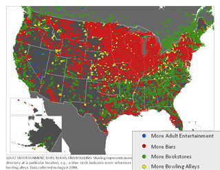
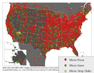
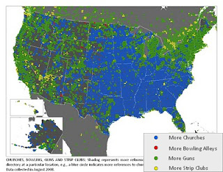
There’s probably a perfectly reasonable explanation behind every one of these data points, aside from paying customers, but until someone figures them out, enjoy generating your own theories about this collection of maps from Floating Sheep.  Each shows the prevalence of various public venues in the landscape of American culture based on results from the Google Maps directory.

Click the map for a larger version, click the match-up for the original Floating Sheep post:

[Bars vs Grocery Stores] [Adult Ent vs. Bars vs. Books vs. Bowling]
[Pizza vs. Guns vs. Strip Clubs] [Church vs. Bowling vs. Guns vs. Strip Clubs]

Find more maps and fun at Floatingsheep.org.

The Best of the America’s Worst

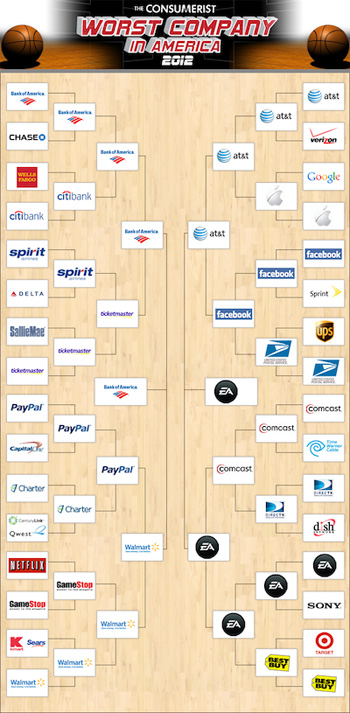
The voting has ended over at The Consumerist and Electronic Arts has won the title of Worst Company in America for 2012.

Bank of America made it to the final match-up for a second year in a row, but failed to worst EA this year as it did with BP in 2011.  The bracket brought together 32 of the least admired companies America has to offer and you can click on the image for the full bracket and blow-by-blow accounts of this year’s battle.

If you’d like to explore the history of the contest, here’s an archive of all the tournaments going back to The Consumerist’s start:

WCIA 2011BP beats Bank of America [bracket]
WCIA 2010Comcast beats Ticketmaster [bracket]
WCIA 2009AIG beats Comcast [bracket] WCIA 2008Countrywide Home Loans beats Comcast [bracket]
WCIA 2007RIAA beats Halliburton [bracket]
WCIA 2006Halliburton beats ChoicePoint [bracket]

Notice all the repeats.  Apparently “worst” doesn’t mean they won’t be around next year.  But where else are you going to take your demand when the largest companies control almost all of the supply?

Land of the Satisfactorily Free (or The U.S. Gets a Yellow Card)

posted in: Ape Con Myth, Maps 0

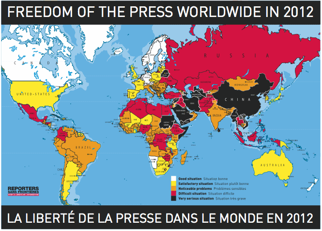
Thanks to Occupy Wall Street and the arrest of journalists covering it, the United States fell 27 places in Reporters Without Borders’ latest Press Freedom Index.  The thanks is for the heads up on yet another soft spot in our democracy.  You don’t have to look at this map long to appreciate what a rare thing freedom can be.

freedom of the press map(click to enlarge)

Sadly, there are 130 countries with less satisfactory conditions.  Some much less so…

From the release:

It is no surprise that the same trio of countries, Eritrea, Turkmenistan and North Korea, absolute dictatorships that permit no civil liberties, again occupy the last three places in the index. This year, they are immediately preceded at the bottom by Syria, Iran and China, three countries that seem to have lost contact with reality as they have been sucked into an insane spiral of terror, and by Bahrain and Vietnam, quintessential oppressive regimes. Other countries such as Uganda and Belarus have also become much more repressive.

That’s the other side of this coin.  It’s the place we are trying not to go when we cry foul.  It shouldn’t matter what you think of those getting arrested.  No news is bad news.

Unfortunately over the weekend the Oakland Police Department started working on dropping the United States down a few more slots.  On Saturday night, Occupy Oakland had another run-in with the OPD in which 400 people were arrested, including six reporters.

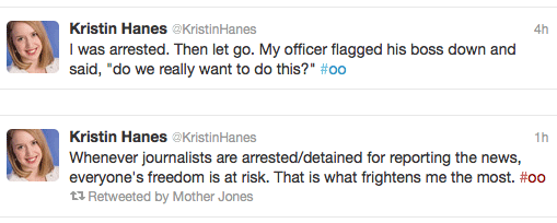
Though four were released on the scene, two got to see the inside of a jail before the night was over.  Gavin Aronsen was one of those two and wrote up the story over at Mother Jones.  Below, a couple of tweets from Kristin Hanes, one of the semi-lucky reporters, who sums it all up quite well:

Luckily a judge has had his eye on the OPD for a while now and this weekend likely increased the odds the department will go into federal receivership for being “woefully behind its peers around the state and nation”.  Not that Oakland’s is the only force dragging down the country’s freedom of the press rankings.  If you want to see the full journalist arrest tally or follow it as the Occupy movement continues its diagnostic tests of the United States’ checks and balances, Josh Stearns is tracking it right here.

[Press Freedom Index via Boing Boing; High-res map in report PDF]

Would You Like Your Receipt?

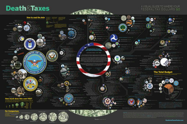
Updated for its fourth year, the Death & Taxes: 2012 infographic is back and ready to answer all some of your federal tax withholding questions.

(click to explore)

The focus of the chart is discretionary spending (ie. what Congress must vote on each year) and includes figures from the President’s Budget for 2012, along with percent change from 2011 and 2002, respectively.  It’s a dense presentation, but $1.242 Trillion is a lot of dough.

[Death & Taxes]

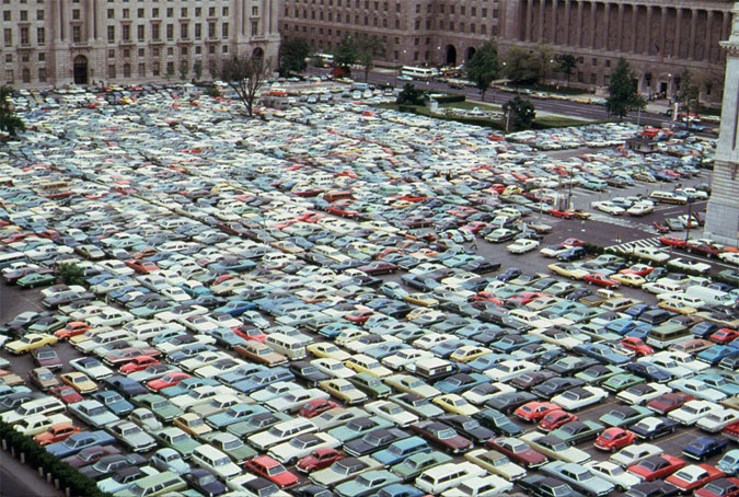
A Day Without Buses in 1974

Soon after Nixon created the Environmental Protection Agency in 1970, the agency recruited a small army of photographers to document the state of the natural environment in the United States.  The DOCUMERICA project collected over 20,000 photographs between 1971-1977  and along the way captured the state of American life itself, driving home the connection between the two.

The National Archives has digitized 15,000 of these images, selections of which can be found on Flickr or in their entirety through the Archival Research Catalog.

Your 70’s time machine awaits you…

(A D.C. parking lot during a bus strike in 1974 – Jim Pickerell/NARA)

[The Atlantic via Boing Boing]

Dragged to the Back of the Pack

Every once in a while you have to reassess the things you are proud of.  Is the quality that first inspired you still important?  Is it still there?

Does the idea of America in your mind include the Czech Republic possessing a vastly superior ability to keep its citizens above the poverty line?

Is being below-average part of the plan?
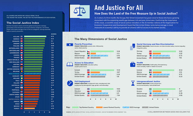
(click for the full-sized version)

The way our government operates, you’d assume it represents a nation of people only interested in corporate profits.  As if our drive as a nation were to put money over every other concern, from the quality of products and services to the quality of life itself.

If the economy can not remain stable, if a person can not create a livelihood within the economy, the economy can not be called dependable.  It becomes a risk that must be hedged.  The government represents the people’s hedge.

If big business can not deliver, they should lose the competition, not be allowed to rewrite the rules so they still win.  If they don’t want to compete, they are unfit to lead and endanger us with their attempts to manipulate our government.

They can go to the back of the pack if they want, but should not be allowed to take our country with them.  We’re better than that.

This isn’t Corporate America.  This is the United States of America.  We’re the boss here.

[Infographic from GOOD Magazine]
1 2