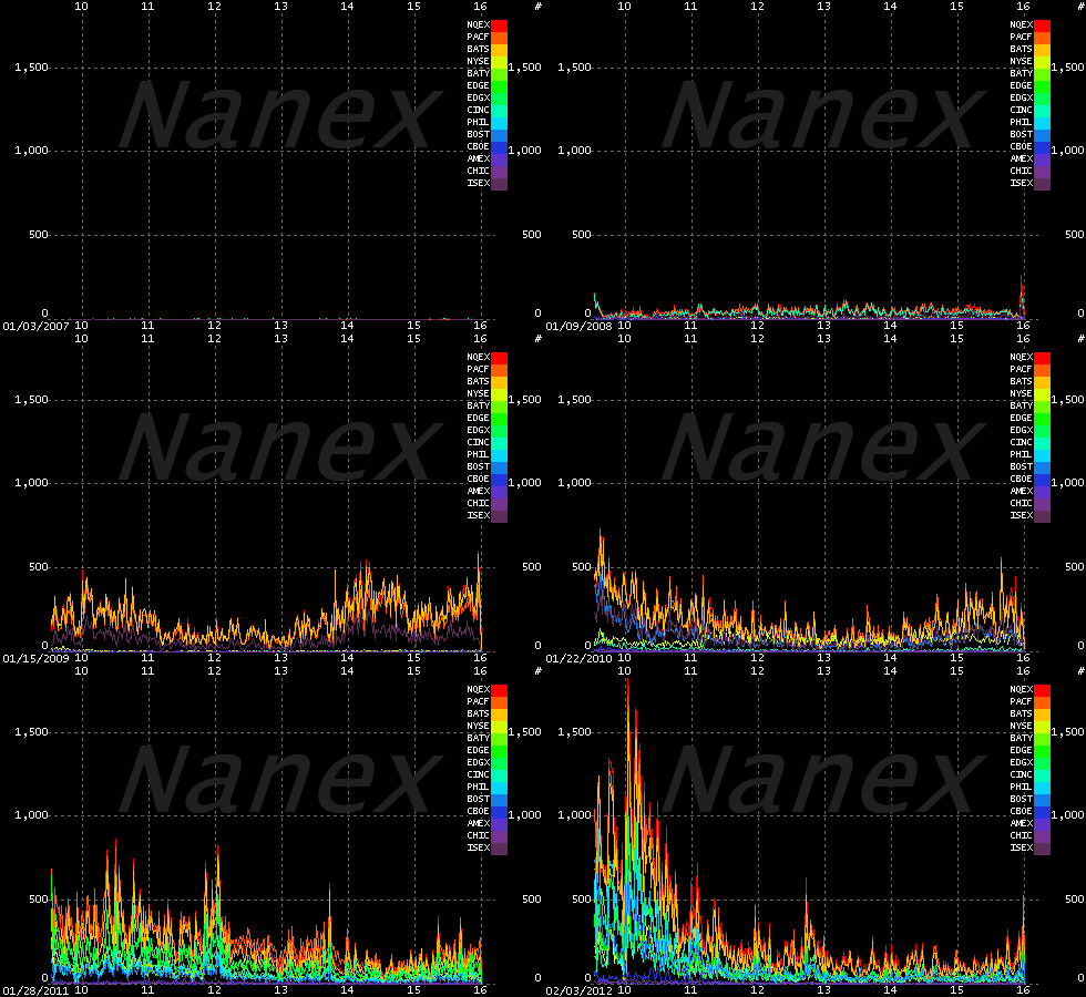
What is the creeping menace shown in the haunted chart below? It’s the amount of high frequency trading in the stock market from the beginning of time January 2007 through January 2012…

Each color stands for a different U.S. stock exchange and the x-axis lays out the hours of each trading day, from 9:30am to 4pm EST. What is it supposed to look like?  There is no correct answer, but the key is to notice that this phenomenon barely shows up in 2007 and initially only involved spikes at the open and the close of each day. … And then it just kind of goes nuts. … Much as it did last week when Knight Capital Group’s high frequency trading monster program went rogue and couldn’t be shut down for half an hour.
What kind of effect can one company’s trading program have?
A New York Times analysis of New York Stock Exchange volume on Wednesday morning showed that during the first minute of trading there was 12 percent more trading in all stocks than there had been on average during the previous seven days. By the third minute of trading there was 116 percent more trading than the previous week’s average. The difference reached a peak at 9:58 a.m., when the volume was six times greater. After that, trading volume fell off sharply, nearing the recent average at 10:15 a.m.
Now, where is it that we’re supposed to put all of our money for retirement, you know, to keep it safe?
[Chart from Nanex via Felix Salmon]